The company Pantone declares itself as “the global colour authority,” setting standards for the design community. Every year they choose a colour (normally one, but this year, two) which they feel will set the tone (pun intended) for that year. The idea is to pay attention to what is happening in our global culture and express what people are looking for through colour.
Let’s explore the colours for 2021 and how to use them for your interiors:
What 2021 Colours Represent According to Pantone
Ultimate Grey
Thoughtful
Solid (like a rock or pebble)
Dependable and Foundational
Assuring
Steadfast, Resilient, and Enduring
Strong
Composed
Illuminating Yellow
Optimistic
Hopeful and Promising
Bright and Cheerful
Vivacious and Warming, like the Sun
Uplifting
Lively
Heightened Awareness
With the global pandemic creating unexpected change on a massive scale, it’s no wonder Pantone chose colours with themes of fortification, energy, and clarity.
Pantone usually chooses only one colour, and choosing two for this year was very intentional, displaying how different elements can come together to support each other. Positivity is supported by strength, not in isolation to it. They call the effect of the pairing “aspirational.”
Home Decor
Pantone claims that decorating the home with these hues will send a warm welcoming message supported by dependability. In the office (or home office) they will inspire curiosity, resourcefulness, and open-mindedness. With so much reinventing, these moods will help to not only cope, but thrive in a new situation.
Here are some ways you can incorporate them into your home:
Standout Pieces
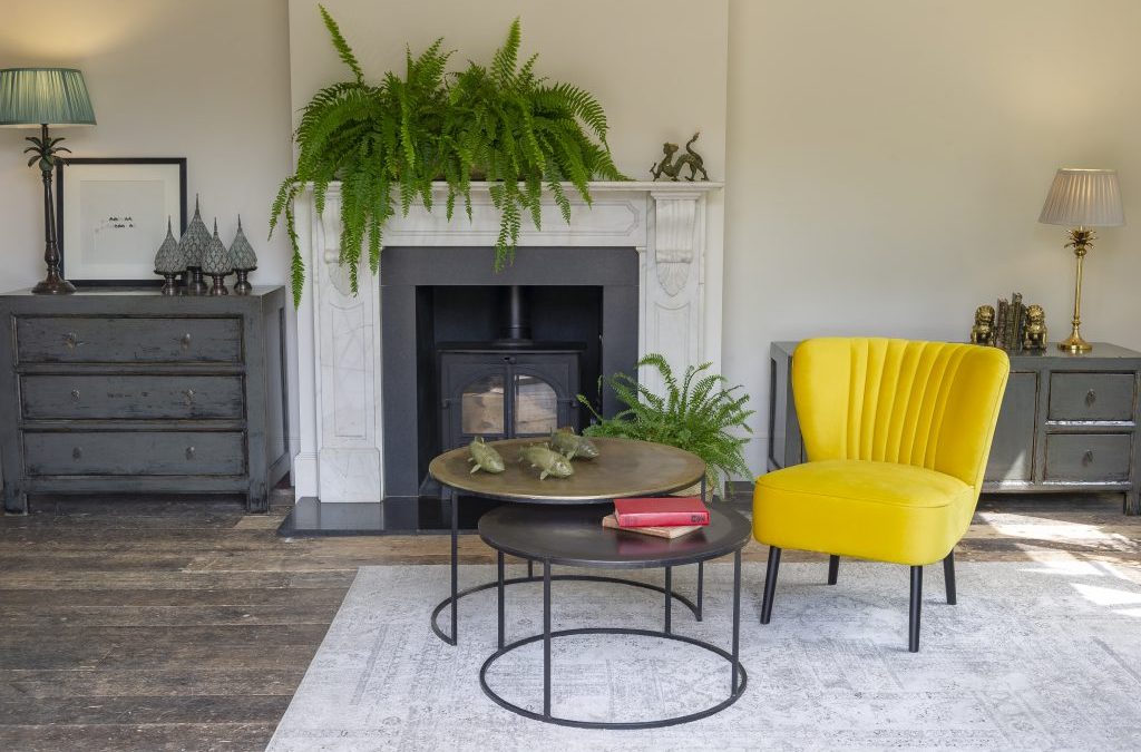
The most obvious way to honour these new colour suggestions is to get some new furniture in the said colours. You’d be hard luck to find a grey and yellow couch, so we suggest picking a main colour and using the other to accent. You could go bold and choose some yellow pieces, but it’s probably more likely you’ll pick a grey one like this fabulous Leather lounge, or the modern upholstered Marley.
Walls and Doors
It’s easy enough to change the colours of your doors and walls; plus, if you’ll simply do a paint job, you can get the exact hues recommended by Pantone for the year. A bright yellow door with grey for the exterior finishes is a perfect example and even recommended by Pantone in their press release. Or think of a textured grey wall, paired with furniture with smooth surfaces, like the Alma chair with fabric coverings or a suede-detailed fabric Florence sofa.
The Non-Commital
If you want to pay tribute to the colours of the year without purchasing big new pieces, you can instead focus on accent pieces and accessories. These can be throw pillows or throw rugs. Table linens can work for kitchen and dining, or yellow or grey sheets may be used in the bedroom.
Go with the Flow
Using Pantone’s colours of the year in your home will help you connect with the energy people are experience worldwide, and enable you to use it to your advantage. And when you’re done setting it all up, go ahead, share it on social media- spread the joy, and the strength, and the solidarity needed by 2021; all set by the Pantone colours of the year.
Read Also:
Summer Trends for a Fresh Living Room
4 Things to Consider When Shopping for Dining Room Seating
Leather Lounge Myths